Wednesday, 22 September 2010

changes to my poaster

i have made some changes to the design of my character. to show that she is ment to represent the pearl i have drawn her using the colours white gray and pink. i put pink in because you can get pink pearls. the pink circles on her dress are ment to be pearls and when they are coloured in it will look shiny. the reason why i hve drawn my lineart with colour is because if i used black then it will dilute the colour and the colours will be less vibrant

i have also changed her hair because before her hair wasnt well thought through and it didnt look spetial. another reason why i changed her hair was because it would take up less time colouring it in so then i could do bettr shaiding

my poaster so far

this is my poatser so far. today i drew the lineart and started to colour ad shade the skin.
i dont like the way that my lineart has turnend out because i used the brush tool so it didnt give a line with the same thicknes all the way down so i will re-do my lineart with the pen tool

typography

today we looked at typography there are three types of typoghraphy
serif, sans serif and sckript
the way i made this typography is i opened up photoshop and then whent to the window option and clicked character, that brought up a small window that let us change the text.
it let you change the space imbetween each letter (kerning and leeding)
it also let us cange the colour and font of the text

Tuesday, 21 September 2010

ruff sketch

after doing my research i came up with this as my poaster. its just a draft and i may change it. i also nead to add some things into the background

under water reasearch

we were told to create a poaster that related to under water life so
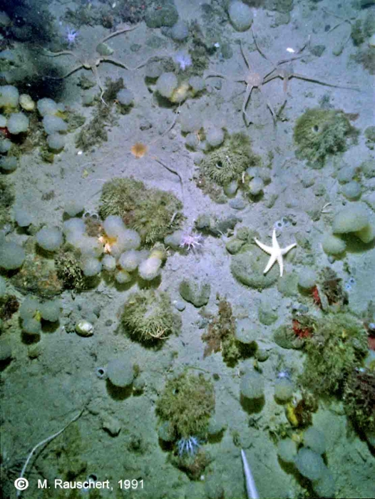
i have researched a few things to do with under water. the first thing i had noticed is that the light shines through like rays and the closer to the serfice those rays are the brighter they get. the second thing i looked at was the sea floor and what lived on it. after looking at a couple pictures i noticed that you would normaly find shells and other furry plants. so i decided to look at shells.

i realy liked the idea of having shells in my poaster so i looked at types of shells and i liked the pearl clam shell so i thought of ways to make the pearl have more ephisis because it is and important part of that shell and then i found this picture (picture bellow) and it gave me an idea. i want to create a picture of a pearl clam under water with a girl representing the pearl because then the pearl which is normaly small and not realy notisable would then become a big part of the poaster

Simone Legno

i like how he uses bold lines and few colours because it makes the character stand out and the limit of shaiding makes the characters brighter. i also like the way he draws the charcters with not much detaial and smooth edges because it makes the characters look cute
but i dont like the way he draws the eyes on the girl (human) because they are just a line and i think that the eyes should be drawn with some detail as that is the moast important part of the face


hyung tae kim

hyung tae kim is a Korean artist. He has designed characters for video games such as the magna carta series and the later installments of the war of genesis series. Kim began a video games career working in the field of background music, then shifted to art and design. He has also branched out into the comic book industry

hyung tae kim works with SoftMax 

i like the way that his style is halfway imbetween manga and a realistic style. the way that the character is standing is intereasting. and i like the way that the character relates to the background. all the colours compliment the character very well. and the background isnt plain there is actualy objects in the background that have something to do with the character.
i dont like the way that he puts a glowing outline behind the girl in the picture above because it makes her look like she isnt part of the background behind her